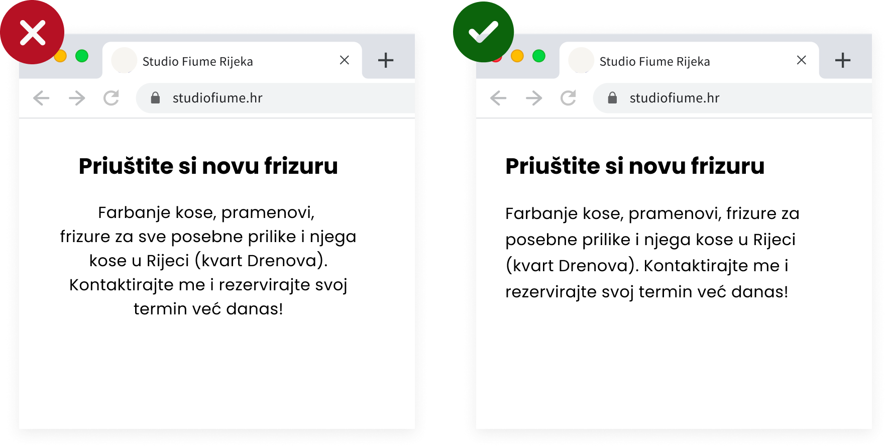
1. Alignment
When in doubt (especially with longer text), align your text to the left.
Why? Because we are used to reading from left to right. By aligning the text to the left, the eye can more easily find the edge, and the text becomes much simpler and quicker to read.
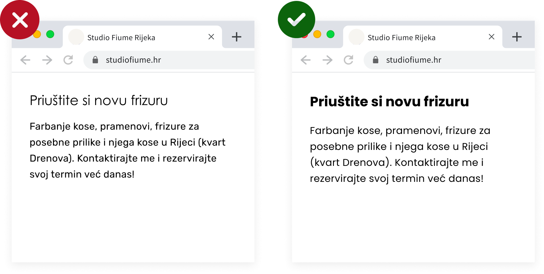
2. One Font
Using two different fonts can be tricky unless you are sure they complement each other.
In general, avoid combining two fonts from the same classification. For example, don’t use two sans serif or two serif fonts together because you won’t achieve contrast.
3. Size x2
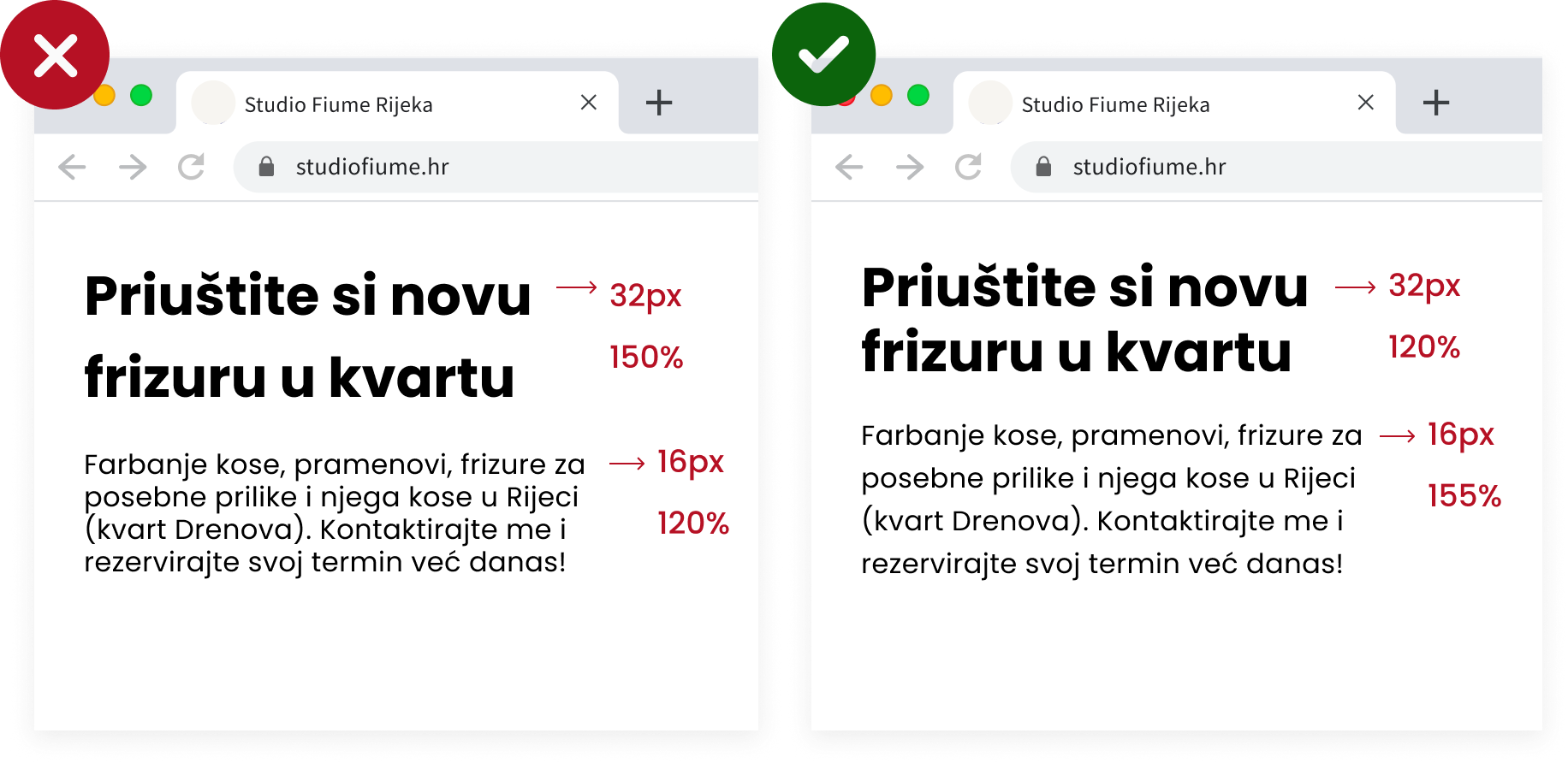
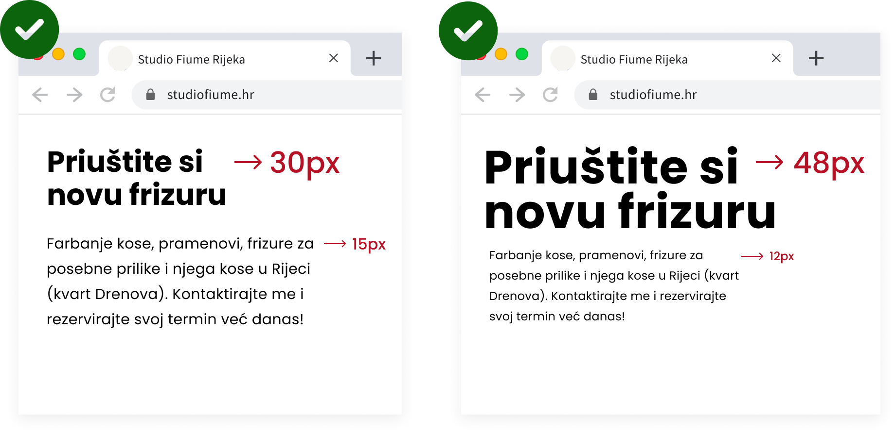
A good rule when changing font size is to either double it or cut it in half. For example, if you use 30px for a heading, use 15px for the body text.
You can also experiment with 3x or 4x larger font sizes to achieve a more dramatic effect.
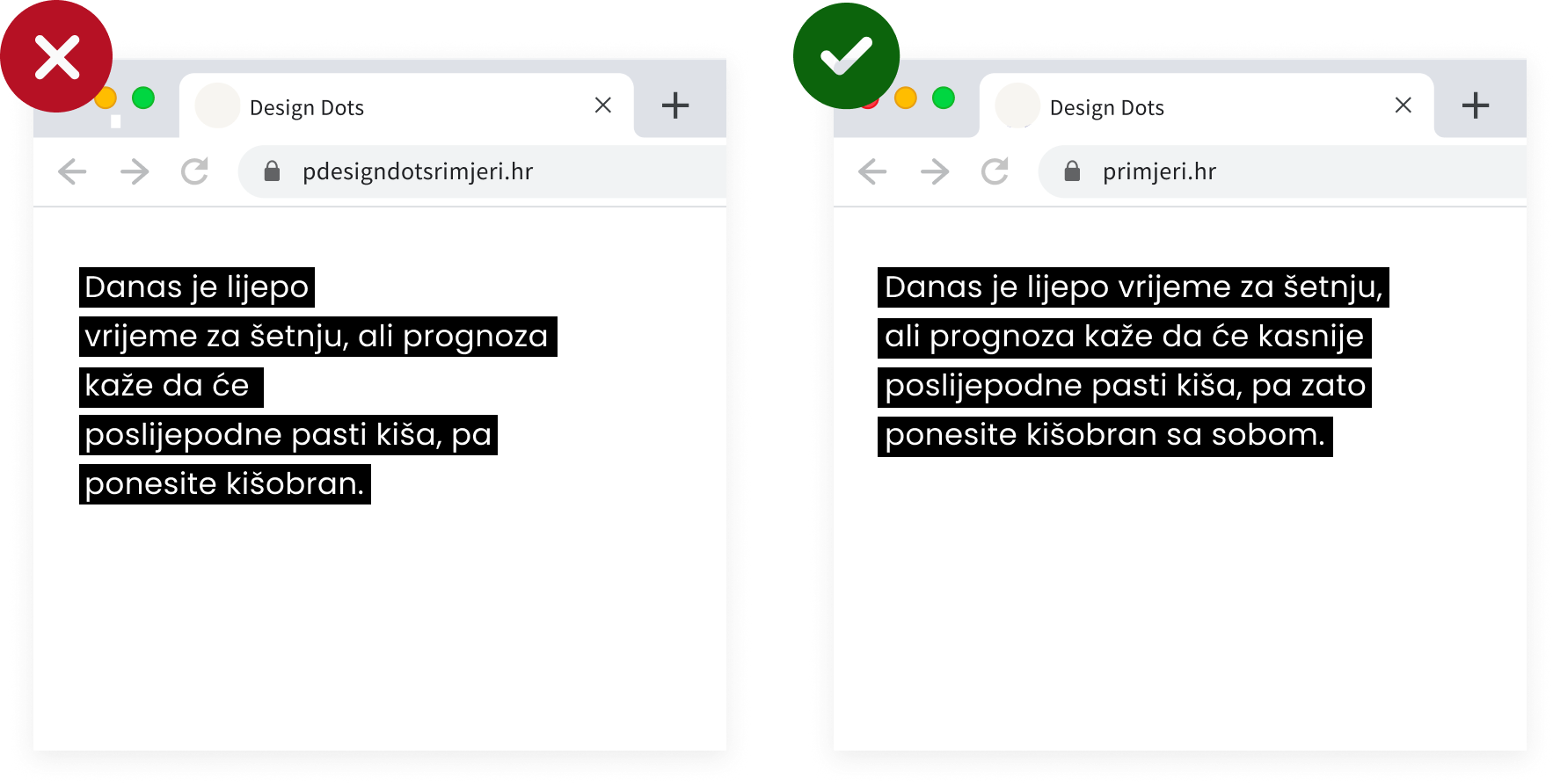
4. Text Shape
Always use a single space after punctuation in a sentence. Also pay attention to the shape created by the ragged right edge of the text, so you can avoid unwanted shapes or angles.
Of course – unless you are writing poetry 😀
5. Line Spacing
Line spacing, or line-height, is the space between lines of text. Too little spacing makes the text feel “cramped,” while too much spacing breaks the reading rhythm.
The optimal spacing depends on the size and type of font, but it usually falls between 120% and 150% of the font size.